The New Zealand Garden Bird Survey (NZGBS) is a national survey of garden birds carried out each year from late June into the first week of July. Volunteers are asked to record the type and number of birds they detect over a one hour period. The primary aim of the NZGBS is to answer the question of whether garden bird populations are increasing, decreasing or remaining stable.
However in order to reliably answer this question, the raw results need to be turned into meaningful summaries. In general, the raw data of bird counts per garden for a given year are averaged to give a value that represents the mean (i.e. average) number per garden for that year. A species that is increasing over time will have an average count that also increases over time, and vice versa.
In principal, calculating both the annual average and the trend is straightforward, however as we will explain, a number of challenges are present.
Calculating the national average
Regional differences in the abundance of a species coupled with the changing proportion of survey returns from each region can make it appear as though the species has changed over time, even though it is only the proportion of survey returns that is changing!
Here we illustrate why it is important to develop a robust process for calculating the national average number of tūī for the Garden Bird Survey.
The simplest approach: providing misleading results?

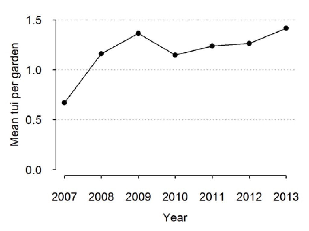
Figure 1: The average number of tūī per garden for New Zealand
When we examine the time series that results from a simple average of bird counts (Figure 1), it would appear as though the mean number of tūī per garden has increased from 2007 to 2013. But is this really the case?
At its simplest, the average number of a particular bird species per garden can be calculated as the total number of birds of that species counted across all gardens divided by the total number of gardens surveyed. This is calculated separately each year and results plotted as a time series to give an indication as to whether the population is changing over time.
In 2010, for example, 4732 tūī were counted in 4124 garden bird surveys, resulting in 1.14 tūī per garden. The following year 3826 tūī were counted in 3092 gardens, resulting in 1.23 tūī per garden, etc..
Digging a bit deeper: understanding survey participation rates
The apparent increase change in tūī per garden appears to be mostly an artefact of the changing proportion of respondents, especially from Canterbury.
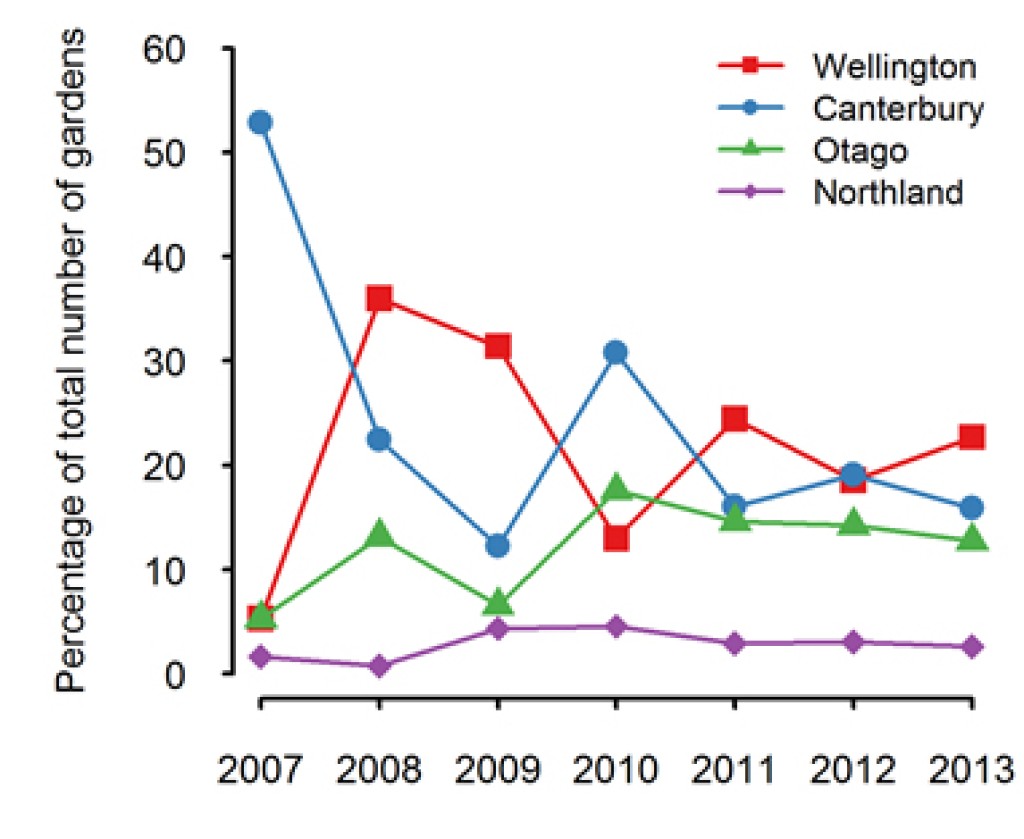
Let us consider for a moment where the survey respondents came from each year (Figure 2). In 2007, more than 50% of the surveys were from Canterbury. This percentage dropped in 2008 and again in 2009, rising to 30% in 2010, and then remaining somewhat consistent from 2010 to 2013.
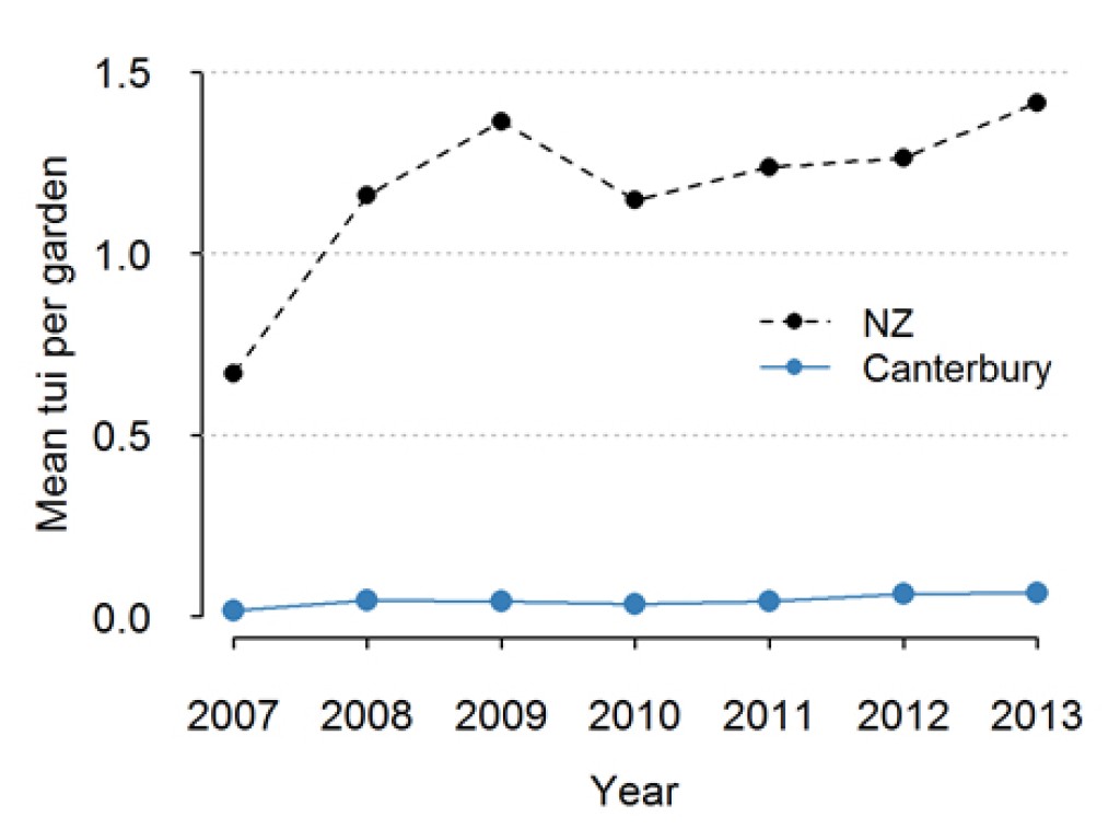
When we compare the mean tūī per garden (Figure 3) to the percentage of total gardens from Canterbury (Figure 2), the two lines practically mirror each other – when the percentage of survey returns from Canterbury is high, the mean tūī per garden is low, and vice versa.
This is not surprising when we look at the mean tūī per garden from Canterbury only (Figure 4). Tūī are relatively uncommon in Canterbury, with results from the NZGBS indicating a regional average of only 0.05 tūī per garden. More importantly, the results do not appear to change over time.
Taking into account garden numbers helps

Figure 5: The average number of tūī per garden for New Zealand both unweighted and weighted by region from the GBS for the period 2007 to 2013
When calculating a national average, the results must be adjusted to reflect the proportion of gardens from each region.
In an ideal situation, a survey return would be received each year from every garden in every region. Failing this, the number of survey returns from each region should be proportional to the number of gardens in that region. If the number of survey returns from each region was proportional to the number of gardens, then the mean number of birds per garden could be calculated as before and the mean birds per garden would be representative. Any changes in the mean count could more reliably be attributed to actual changes in population size.
This is unlikely to occur in practice – for whatever reason, some regions will be under or over-represented in the survey. Fortunately, we can correct for this by taking a weighted average of the count data with the weights equal to the proportion of the population from each region. To do this, averages are calculated for each region, and then multiplied by the proportion of the population that live in each region, and these values summed. For example, Canterbury contains approximately 12.6% of the population, whereas Northland contains only 3% of the population. Therefore the regional averages from Canterbury are multiplied by 0.126, and the regional averages from Northland are multiplied 0.03, etc
This weighted average removes the bias that can arise when regions are under or over represented in the survey returns, and more importantly when the percentage of survey returns from a region changes over time.
When we apply this weighting, we can see the trend in tūī per garden is much less pronounced.
Other factors are also important

Figure 6: The average number of tūī per garden for New Zealand, unweighted, weighted by region, and weighted by region and garden type, from the NZGBS for the period 2007 to 2013.
When calculating a national average, the results must be adjusted to reflect other factors such as the type of garden.
There are many other factors aside from regional differences that will affect the mean counts. For example, some species are more likely to be found in rural gardens as opposed to urban gardens. The proportion of survey returns from rural areas has increased from 19% in 2007 to 27% in 2012. If we do not account for Garden Type, then species that are more common in rural gardens will show an apparent increase in abundance that is not due to any real change in their abundance.
When we apply an additional weighting for garden type (Figure 6) the results do not change much in this case. It appears as though tūī are not as affected by Garden Type as they are by Region.
Regional picture: is it representative?
Regions with small numbers of survey returns are less likely to be representative of all households from the region.
Larger numbers, greater confidence?
Since its inception in 2007, some regions have very low numbers of survey returns to the Garden Bird Survey. For example the number of surveys from Gisborne is typically between 10 and 20.
The results from regions with very low numbers of participants are less likely to be representative of the region than results from regions with more participants.
Also, for regions with low numbers of participants, we have less confidence that the results from those regions are truly representative of the entire region.
Location of participants?
All other things being equal, we would be more confident in regional averages from Wellington (which has more than 700 surveys per year) than from Gisborne.
Of course it is still possible that the respondents from Gisborne are spread randomly across the region, and those from Wellington are clustered in one small area, in which case the Gisborne results would be more representative of their region.
How to deal with this issue?
One simple way to account for this is to join some regions together. This is a valid approach when regions are adjacent to each other and there is not large variation in bird abundances between those adjacent regions. Previous analyses from the NZGBS have combined data from Gisborne with Hawke’s Bay, Bay of Plenty with Waikato, Taranaki with Manawatu-Wanganui, and Nelson City with Tasman.
Reading signals from noisy data
When determining whether an observed increase is real, we must separate the signal from the noise — an increasing trend does not necessarily mean that the population is increasing.
The mean birds per garden per year and the resulting time series gives us some information as to whether the garden bird abundance of a species is changing over time.
However, we are more interested in identifying a long-term trend, i.e. a persistent increase or decrease in the abundance of the species. This can be termed the signal.
Here we illustrate why reading that signal can be tricky and highlight some ways to overcome those challenges.

Figure 7 illustrates how difficult it can be to determine the true trend straight line from data points when there is either a weak signal and/or a high degree of noise
Noisy data can mask a signal
When determining whether an observed increase is real, we must separate the signal from the noise.
Unfortunately bird count data is noisy: fluctuations in counts from year to year are expected due to reasons not related to bird abundance (e.g. poor weather making birds less or more active, observer effects, etc), as well as factors that cause shorter term changes in abundance (food availability and predation pressure).
Distinguishing the long-term population signal from the sampling noise can be difficult (Figure 7). Fortunately there are methods that can make it possible.
How to reduce the noise
Accounting for sources of noise in the data can make it easier to detect the signal.
In order to identify the trend (i.e. the true underlying change in the population), we must account for those factors that may be influencing the observed counts but not the actual trend itself. Doing this removes some of the noise in the data making it easier to detect the signal.
Accounting for sources of noise
As we have seen, two important factors are the Region where respondents live and whether the Garden Type is rural or urban.
To illustrate the effects of accounting (or not accounting) for various factors, we calculated the trend four different ways:
- We ignored the effects of region and garden-type (denoted as Year only)
- We accounted for region but not garden-type (Year+Region)
- We accounted for garden-type but not region (Year+GardenType)
- We accounted for both region and garden-type (Year+Region+GardenType).
Example: Changes in tūī abundance in gardens

Figure 8 illustrates the annual change in tūī abundance relative to measurements in 2007 for four different estimates of trend.
For tūī, the annual trend based on the raw data (Year only) suggests that tūī have increased in abundance in gardens at a rate of approximately 7% per annum. This reflects what we observed in Figure 8.
When we account for region (Year+Region), our best estimate of the increase in tūī abundance is only 2% per annum (see Figure).
When we also account for Garden Type in addition to Region (Year+Region+GardenType), there is even less evidence of a change in tūī abundance.
This analysis suggests that any apparent increase in tūī abundance based on the mean counts per garden is predominantly due to annual changes in the survey returns from different regions and from garden types.
A note of caution
It is important to note that there are likely to be other factors not yet accounted for.
The salient point is that any apparent trend in abundance from the Garden Bird Survey may be due to issues related to sampling as opposed to changes in underlying abundance.
Is the signal real?
An increasing trend does not necessarily mean that the population is increasing.
Is removing noise enough?
Even when we remove as much of the noise as we can (i.e. by accounting for region and garden-type) it still appears from the adjacent figure below as though tūī are increasing slightly. But are they really?
There are methods available to us that tell us how likely it is that any observed increase is actually due to chance.
We can investigate this by determining what patterns we could likely see if tūī were not in fact increasing but remaining stable.
Essentially we are including a degree of uncertainty with our trend.

Figure 9 illustrates the annual change in tūī abundance relative to measurements in 2007 for four different estimates of trend
Measuring uncertainty?
Figure 10 below shows our best estimate of trend when we account for region and garden-type.
This time however we have included our uncertainty about this trend, as indicated by the grey shaded area.
Some of this grey shaded area is below the zero change line, indicating that there is a chance that tūī are in fact decreasing, despite our best estimate indicating a slight increase.
Our conclusion therefore is that we cannot be reliably sure as to whether tūī are increasing or decreasing.

Figure 10 illustrates the annual change in tūī abundance relative to measurements in 2007 when we account for region and garden type as well as our uncertainty about that change